

I’ve discussed in a previous blog post that Budget Pro and Budget are two different Apps. I won’t repeat the rationale here, however regardless of my choice I will still need to rewrite the code for the “budget service“.
What is the budget service?
The budget service receives a collection of “budget items” from the Costs to Expect API. It is responsible for taking these budget item definitions and then creating the users Budget.
Budget items have several parameters controlling whether and how they should appear on the users Budget.
| Parameter: | Description: |
| Frequency | How often does the budget item repeat and how does it repeat? |
| Start Date | When is the budget item effective from? |
| End Date | When is the budget item effective until? |
| Adjustment | Has the budget item been adjusted, for example value changed |
| Paid | Has the budget item been marked as paid for the selected period? |
| Disabled | Has the budget item been marked as disabled? |
| Account | Which account does the budget item belong to? |
| Type | What is the type of the budget item, income, savings, expense etc. |
The service iterates through all the defined budget items and allocates them to each period (month) accordingly. From this, the service then calculates the projected balance for each defined account.
Why the code rewrite?
The existing budget service is serviceable. It has warts because features were added after the original design but other than me being unhappy with it, it works well enough and has tests. Me being unhappy with it is not reason enough to rewrite, we would never release anything if we kept refactoring code each time we were unhappy with it.
So, why a full code rewrite?
Well, Budget Pro is significantly more complicated that Budget. In Budget Pro we support multiple period types, many more adjustments, custom display options as well as other changes. Additionally, users can have multiple budgets meaning the service needs to know which budget it is handling as well as the permissions due to sharing features.
The original service wasn’t designed to handle custom display options let alone more advanced parameters. The budget service already feels “wrong” so although I could tack on support for all these features, I would end up with something even more clunky than now and inevitably need to rewrite it anyway.
Struggling?
What is the problem, why the need for a blog post? Well, I’m struggling, and I think I’ve worked out why.
When I created the original budget service I was working from a clean sheet. I had the data the service would use; I had a design to achieve, and I could decide how I got from A to B.
With the new service, I have a lot more baggage; I have the data, I have an updated design for the UI, I know the new features but I also have an example of a service that doesn’t work.
We all code in a specific way and this is the problem. I know what I did before isn’t right; however it does solve the problem. I could go back to basics and design from a clean sheet but that is foolish because of the existing service. As much as the existing service won’t work for Budget Pro, it has been improved over time and works and obviously, some of what it does is correct.
What am I doing?
I’m designing the new service slowly, bit by bit. I’m keeping an eye on the original service but conscious that there are many things that need to change.
The first major change is support for user options. There are multiple sections of the service that need access to user options. For example, the spend ranges for budget items, the number of ‘periods’ to display and colours. I’ve opted to use a Service Provider to register the Budget service and corresponding helper services. This makes it trivial to access the service throughout the App via the Service Container. The next issue is more parameters, specifically the more complex frequencies and more adjustments. In the original service I handled this as I iterated through the data. With a small number of parameters, this is easy but as the number of parameters grow this gets more difficult. I’m going to create data structure that manage each parameter which will hopefully help me keep the core iterating code nice and simple.
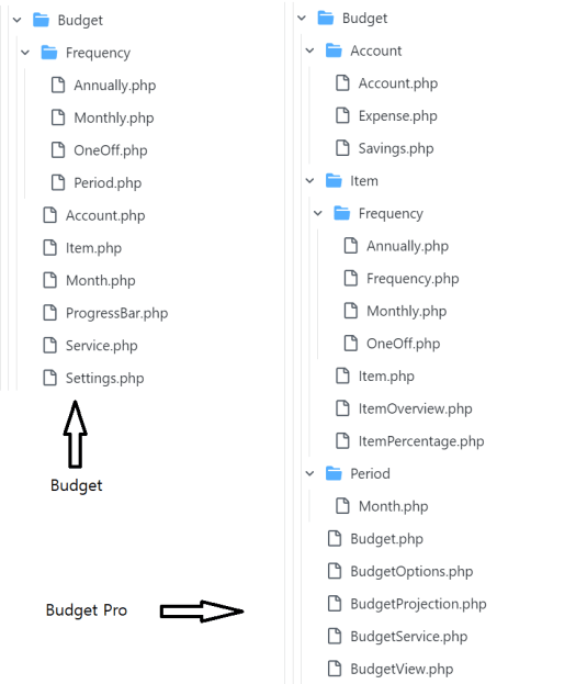
Below is a comparison image for the old and new service. As you can see the complexity has increased. However, the new service is much clearer regarding implementation.
Will it work?
Only time can answer that but yes, I suspect everything will be fine. Yes, there will be bug fixes and there will be addons that make my eye hurt but that is working code.
A year after Budget Pro releases I will be in a better position to answer this question. I will have had to tweak things, fix many bugs, some hopefully due to scale and be working on new features. It will be at this point I will be able to say for sure if all the effort was worthwhile.
